Nowadays, vast amounts of data are collected during any clinical trial and it is essential for pharmaceutical sponsors to understand these data in great detail to make accurate decisions.
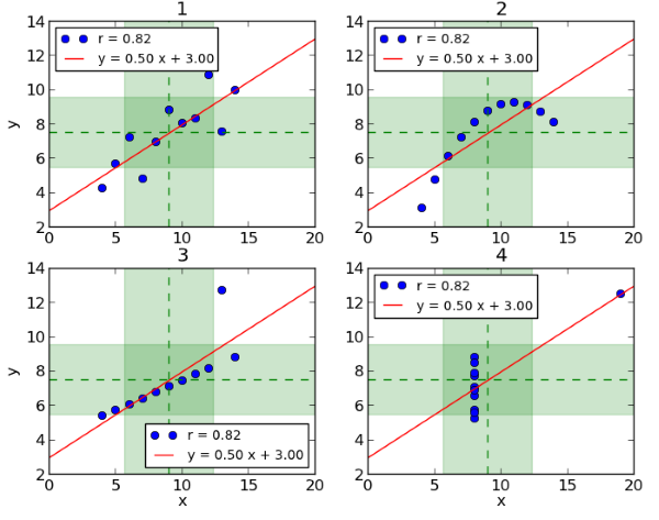
An example of why data visualization is essential for understanding data and making good decisions is Anscombe’s Quartet[1]. It consists of four datasets which are plotted in Figure 1[2] below. It becomes clear at first glance that the relation between x and y is different in each dataset. Dataset 1 (top left) suggests a linear relation and Dataset 2 (top right) a smooth curved relation. In Dataset 3 (bottom left) all but one point lie on an almost straight line and in Dataset 4 (bottom right) all but one point have the same x-value. However, these datasets all share the same mean and variance for x and y, the same correlation between x and y and the same linear regression line. Thus, if we only looked at a table of summary statistics for these datasets without any complementary graphical visualization, the essential differences between them would not come to light. Clinical data visualizations allow us to investigate and to see relationships and patterns in data, while tables can be used as a supportive tool to describe summary patterns.

Figure 1: Anscombe’s Quartett
Figures are part of any submission to a regulatory authority in clinical trials, however, these usually do not include interactive clinical data visualizations. In this blog post we want to present two ideas. First, that interactive clinical data visualizations can add tremendous value during the conduct of a clinical trial and second, that interactive clinical data visualizations are also useful for domains that are often not presented graphically, e.g. adverse events or disposition data.
Interactive data visualization is a powerful tool to investigate data and share detailed insights in an efficient way. It allows slicing and drilling through the data and interactively changing the level of detail you want to see. The idea is not to replace the common reporting of a clinical trial but rather to support it by (1) monitoring and investigating data (see also Risk Based Monitoring), (2) identifying data issues or areas that require special attention, (3) increasing quality of clinical trial reporting, (4) investigating potential covariates and performing ad-hoc analyses, and (5) sharing and presenting results at (regulatory) meetings.
To demonstrate these advantages, three examples of interactive clinical data visualization will be discussed: (1) demographic data, (2) adverse events data and (3) laboratory data.
Example 1: Demographic Data
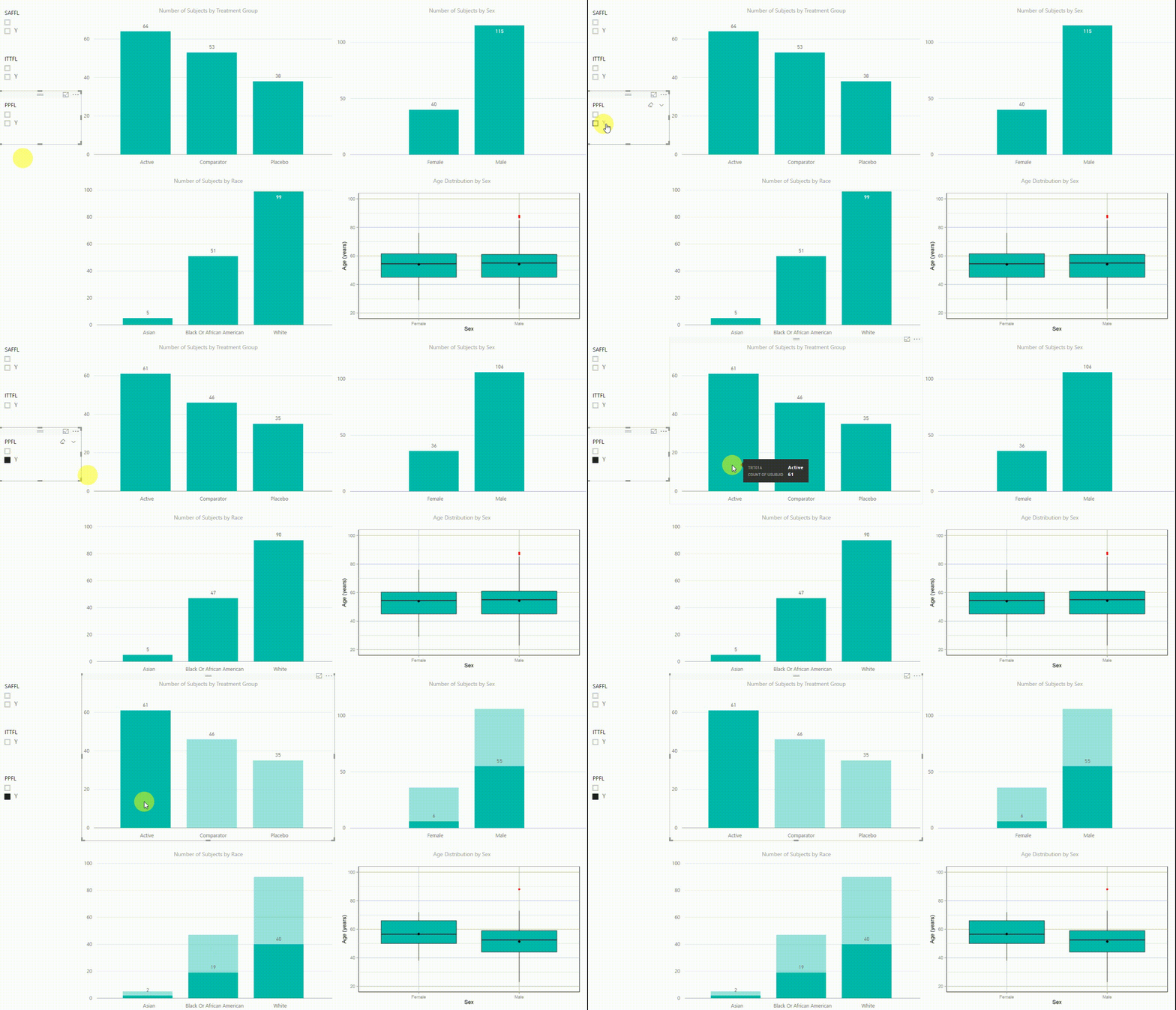
Figure 2: Interactive Data Visualization of Demographic Data [click to enlarge]
Our first example (Figure 2) presents demographic data from an ADSL dataset. This shows (from top left to bottom right) three bar charts of the number of subjects by treatment group, by sex, and by race, followed with a boxplot of age in years by sex. There are population filters on the left hand side which allow you to interactively subset the four plots by the safety, intent-to-treat, or per-protocol population.
The four plots are not only linked with the population flag filters but also among each other. For example, if we click on the bar of the Active treatment group in the top left chart, the other three plots automatically highlight the data of this treatment group. A situation where this could be useful is when a clinician asks for further sub-group analyses. This visualization instantly provides number of subjects and subjects balance across multiple strata.
Example 2: Adverse Events Data
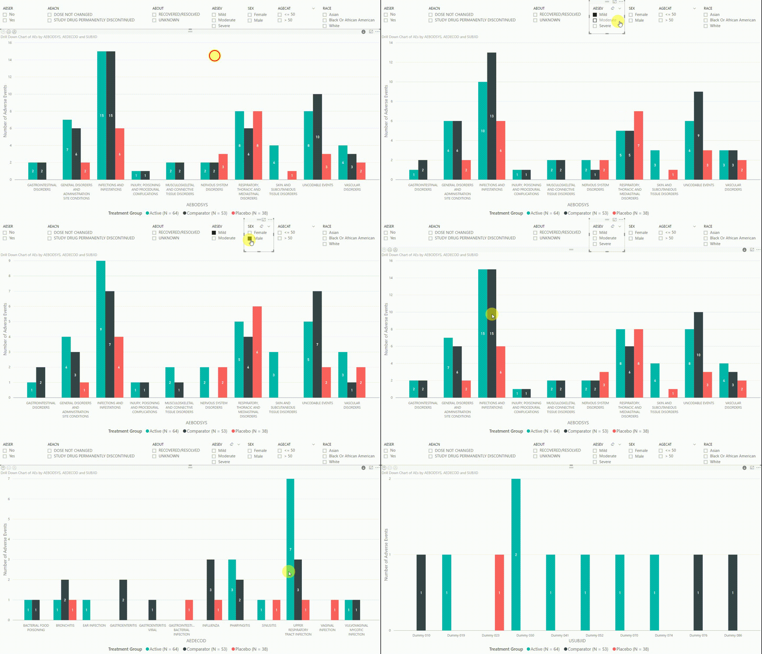
Figure 3: Interactive Data Visualization of Adverse Events Data [click to enlarge]
The clustered bar chart in Figure 3 presents the number of adverse events (AEs) by body system (AEBODSYS). The colours of the columns represent the three treatment groups (Active, Comparator, Placebo) and counts are displayed in the centre of the columns. Above the chart, there are interactive filters that allow you to subset the data by whether the AE is serious, the action taken with study treatment due to the AE, the outcome of the AE, the severity of the AE, sex, age category, and race. By selecting a filter the counts in the bar chart will update automatically to only display AEs that meet the selected filter(s).
Furthermore, by clicking on one of the bars, we can drill down to the next level in the hierarchy, which is the dictionary-derived term of the AE (AEDECOD). For example, by clicking on a bar with body system Infections and Infestations, the chart updates to show the number of AEs by AEDECOD within this body system. We can drill down one more level to see which subjects had how many AEs for a specific type of event. Filters can be (de-)selected at any level of the data. It is also possible to drill down to the next level in the hierarchy without sub-setting the data, e.g. to see AE counts for all dictionary-derived terms and not just the ones within a specific body system.
Example 3: Laboratory Data
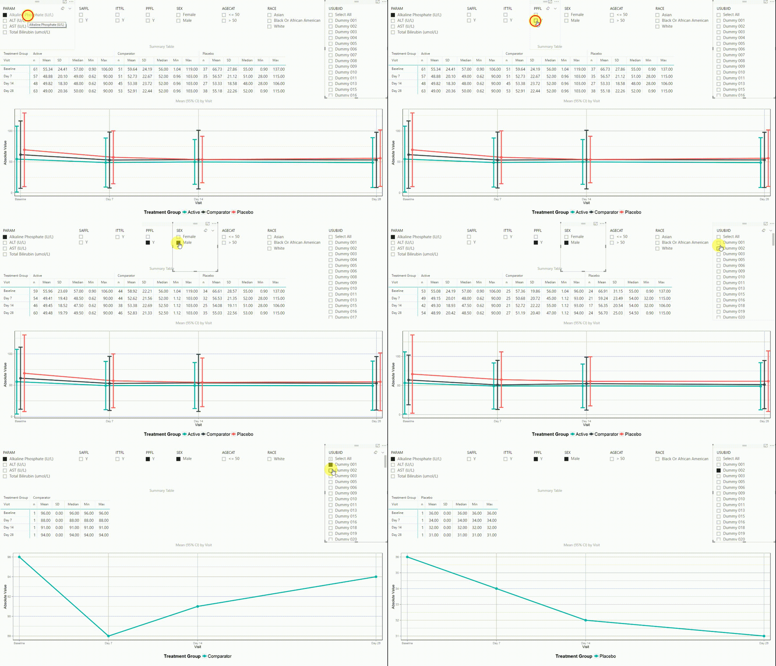
Figure 4: Interactive Data Visualization of Laboratory Data [click to enlarge]
Figure 4 shows filters on the top (similar to Figure 3), a summary table presenting the number of subjects, mean, standard deviation, median, minimum and maximum in the centre, and a plot on the bottom. The plot is presenting means with 95% confidence intervals by visit. This interactive tool can be used to investigate continuous endpoints of a clinical trial, in this case laboratory data.
Using the filter in the top left corner, we can select which laboratory parameter we want to look at. Additionally we can subset the data by population filters and factors such as sex, age category and race. Again, the summary table and plot are updating to display the selected data whenever a filter is (de-)selected. Additionally, a subject can be selected in the top right to drill down in the data and to see the raw values of a single subject.
In summary, the above presented interactive data visualization tools allow you to thoroughly investigate and understand SDTM and ADaM datasets in an efficient manner and to easily identify potential sources of data inconsistencies. In addition to the piles of TLFs that are created for a clinical trial, interactive data visualization can be a valuable tool to share results with study team members and regulatory authorities.
Learn more about how our statistical consultancy group have been utilising clinical data visualizations and could support your clinical trial by requesting a consultation below.
Request a Consultation
References
- Anscombe, F. J. (1973). "Graphs in Statistical Analysis". American Statistician. 27 (1): 17–21.
- Chatterjee, S.; Firat, A. (2007). "Generating Data with Identical Statistics but Dissimilar Graphics: A Follow up to the Anscombe Dataset". American Statistician. 61 (3): 248–254.


