
Easily finding the right information is key to smart and timely business decisions. In Clinical Trials, it can even mean the difference between life and death! There are huge numbers of visualization tools available, but are they best? When you understand your data and user needs fully, are you better off building something from scratch within SAS? Using dummy Clinical Trial data, we'll compare our in-house web-based server-less solution, which uses PROC JSON and the Open Source D3 library for graphing and drill-down. We will also review SAS techniques helpful in building in-house platform: PROC GKPI, PROC STREAM and custom html+JavaScript codes run through SAS. As an alternative we look at paid-for solutions like Microsoft Power BI Desktop. Finally, we‟ll consider if the breadth of options offered by tools like Power BI help or hinder, compared to targeted reports defined by experts.
Dashboards, also known as SAS dashboards or SAS viya dashboards when using SAS/SAS viya, are a very helpful way of presenting aggregated information for various audiences. In Clinical trials examples could involve:
- Patient enrollment characteristics or patient status by site and/or region
- Number of opened/closed queries in Data Management by investigator/site/region
- Comparison of quality of programming deliverable across projects
- Efficiency of programmers within and across projects and many others
During the design stage of a SAS dashboard at least three questions need to be addressed: sources of data for the analysis, programming framework, and content to be used. This paper mainly focuses on the aspect of framework and is organized as follows:
- SAS methods helpful in building dashboards. The main focus will be put on: STREAM/JSON/GKPI procedures and injection of custom HTML/JavaScript code into default HTML produced by SAS
- Usage of Open Source D3/chart.js libraries for graphs and drill-down
- Microsoft Power BI as a platform for building dashboards
- SAS dashboard example of a pie chart based dashboard for status of patients with and without custom injection of JavaScript code to deliver aesthetically pleasing pop-up windows. A comparison will then be made with solutions designed using Microsoft Power BI.
Jump to the desired section:
- Recommended SAS Procedures and Techniques
- Open Source JavaScript Related Libraries
- Microsoft Power BI Desktop
- Pie Chart Like Dashboard - Comparison of Selected Methodologies
Recommended SAS Procedures and Techniques
How to Create Custom HTML files in SAS
SAS can output to HyperText Markup Language (HTML) using the Output Delivery System (ODS), however by default it does this in a rigid way that may not fit everyone‟s needs. If you are interested in more customizable ways of creating HTML files then you need to consider other options. Let‟s see what some of the common techniques are.
PROC STREAM based
From a dashboard perspective PROC STREAM is a very helpful procedure which enhances the way you can create external files – in this context HTML files. It was implemented as experimental in SAS 9.3 so the related solutions noted below will not work on earlier versions. The following code illustrates how PROC STREAM can be used for the production of HTML files. The great advantage of this procedure is the ability to use free text to define the contents without any need to follow specific SAS syntax. You can also use single quotation marks in HTML without additional masking (if the QUOTING=SINGLE option is used) or call macros within PROC step. In the example below the content of the <h2> HTML tag is conditional on the call of %gender.
%MACRO Gender(Sex=);
%if %upcase(&sex)=F %then %let RES=Female;
%else %if %upcase(&sex)=M %then %let RES=Male;
&RES
%MEND;
FILENAME stream "%sysfunc(PATHNAME(WORK))\Sample.html";
PROC STREAM outfile=stream QUOTING=SINGLE;
BEGIN
<!DOCTYPE html>
<html>
<head>
<title>Sample HTML</title>
</head>
<body>
<h1>Patient's data</h1>
<h2>Gender: %Gender(Sex=F)</h2>
</body>
</html>
;;;;
RUN;
PROC STREAM will not follow line breaks as specified in the free text. In other words, HTML will be displayed as expected by the browser but when you look inside HTML file everything will be in one line. This obviously may end up with truncations of HTML code and errors during parsing. You can prevent that by forcing new line by using “&StreamDelim NEWLINE;”. At first sight, you can consider this as significant disadvantage as number of lines of SAS code gets bigger. On the other hand, for most of the cases, during production of dashboards, HTML code will be generated dynamically which minimizes this problem.Code below illustrates usage of breaks:
FILENAME stream "%sysfunc(PATHNAME(WORK))\Sample.html";
PROC STREAM outfile=stream QUOTING=SINGLE;
BEGIN
<!DOCTYPE html>
&StreamDelim NEWLINE;
<html>
&StreamDelim NEWLINE;
<you need to paste %StreamDelim NEWLINE; after each tag>
[ ... ]
&StreamDelim NEWLINE;
</html>
;;;;
RUN;
DATA step & FILE statement based
How could we achieve the same in SAS 9.2 and earlier? In the following code, you need to apply specific SAS data step syntax. Other notes:
- When PROC STREAM is used together with “&StreamDelim NEWLINE;” in actual HTML code all indentions are being displayed as per free text. In case of data step approach this can be achieved by using the $VARYINGw. format as shown in the _null_ data step below.
- In case of more complex HTML (or XML) tags, e.g. containing multiple occurrences of both types of quotation marks, you may be forced to split string expression into concatenated substrings in data step to ensure better control over unbalanced quotation marks. It is obviously not required when you use PROC STREAM.
DATA htmlcode;
length string $100;
string="<!DOCTYPE html>"; OUTPUT;
string="<html>"; OUTPUT;
string=" <head>"; OUTPUT;
string=" <title<Sample HTML</title>"; OUTPUT;
string=" </head>"; OUTPUT;
string=" <body>"; OUTPUT;
string=" <h1>Patient's data</h1>"; OUTPUT;
string=" <h2>Gender: %Gender(Sex=F)</h2>"; OUTPUT;
string=" </body>"; OUTPUT;
string="</html>"; OUTPUT;
RUN;
DATA_null_;
SET htmlcode;
FILE "%SYSFUNC (PATHNAME(WORK)) \sample.html";
varlen=LENGTH(string);
put @1 string $varying200. varlen;
RUN;
To sum up, if your platform is upgraded to SAS 9.3 or later PROC STREAM based approach seems more efficient solution for building dashboards in HTML format.

PROC JSON
During the build of dashboards one of the key requirements will always be the ability to drill down into the data in more details. In other words, you would like to see additional effect(s) when you click a given object on the dashboard. In serverless in-house systems one of the questions is how to pass parameters from one offline HTML page to the other.
This is where JavaScript Object Notation (JSON) objects can be used. The simplest structure of JSON object looks as follows:
{“VAR1”:”VALUE1”, “VAR2”:”VALUE2”, […], “VARn”:”VALUEn”}.
As we can see the first element of each pair is the name of the variable which will be processed by our javascript code and the second is the value. JSON objects can be nested if needed so instead of “VALUEn” we can have another JSON object and so on.
Using JSON objects in hyperlinks can be done as follows: [local path]file.html? {“VAR1”:”VALUE1”, “VAR2”:”VALUE2”, […], “VARn”:”VALUEn”}. However, this is only the first step as JSON then needs to be parsed by javascript so that the variables we've defined in JSON object can be seen during execution of the <script> tag.
Let's consider a simple example:
<!DOCTYPE html>
<html>
<head>
<title>JSON example</title>
<script type='text/javascript'>
var links=decodeURI(location.search.slice(1));
var result=JSON.parse(links);
alert("PatientName: " + result.name);
alert("Surname: " + result.surname);
</script>
</head>
<body>
</body>
</html>
Assuming that you save above code as [path]\file.html and subsequently open it through an Internet browser as follows: file:///[path]/file.html?{ "name":"John","surname":"Smith"} javascript code embedded within <script> tag will 1) extract the part of the URL after the “?” character 2) convert the string into a javascript object 3) display the created variable(s) as pop-ups. For more complex situations it may not be the best practice to use JSON objects directly within URLs, e.g. when the JSON object is large. Instead JSON objects can be saved in external text files in such situations. The logic of the javascript code is still similar to the code presented above, however the main difference is that in a serverless environment you cannot access external files easily solely through javascript. For such situations it is recommended to use a combination of SAS and javascript. A live example of this will be presented later.
So, how can we create JSON strings using SAS? If your company is using SAS 9.4 then PROC JSON is a very good choice. The simplest example is:
PROC JSON OUT="%SYSFUNC(PATHNAME(WORK))\jsonl.txt" PRETTY;
WRITE VALUES 'name':
WRITE VALUES 'John':
WRITE VALUES 'surname':
WRITE VALUES 'Smith':
RUN;
This code will create a simple 2-element JSON object which we used in the earlier javascript example and relies on manually entering all of the values. However, we can also create the file using a pre-populated SAS dataset using the following code:
PROC JSON OUT="%SYSFUNC )PATHNAME(WORK))\json2.txt" PRETTY NOSASTAGS;
EXPORT sashelp.class (keep=name sex);
RUN;
This code automatically produces an n-dimensional JSON array where n = the number of records in the dataset, which in our example is sashelp.class. A given element of the array consists of a container incorporating name & sex variables together with their values. It is worth mentioning that the EXPORT statement will behave differently depending on which options have been used – (NO)KEYS & (NO)SASTAGS. Usage of PRETTY & NOSASTAGS & KEYS options is recommended: PRETTY - creates an user friendly file containing indentions, NOSASTAGS - removes SAS metadata information and in case of EXPORT statement reduces the level of nesting of JSON and finally KEYS – when EXPORT statement is used this option keeps name of SAS data set variables (default).
Both WRITE VALUES and EXPORT statements contain the implicit start of an object/array. This means that it is not needed to close them with WRITE CLOSE (i.e. explicit end is not required).
PROC JSON also offers quite a lot of flexibility in nesting objects. We can use WRITE OPEN OBJECT (which starts with “{“ in the external file) & WRITE OPEN ARRAY (which starts with “[“) statements for initiation. This is an explicit way of creating objects, so this time a corresponding WRITE CLOSE statement is required to close them.
A more custom example of a JSON structure will be presented in a later section.
PROC GKPI
Key Performance Indicators (KPIs) are graphical objects which should be part of any good looking dashboard. This part of the paper will not discuss approximated methods which can be used (e.g. various SAS SG procedures). We will instead focus on PROC GKPI which directly supports production of KPIs.
The following code produces two types of KPIs (traffic lights and dial) and places them on one page using ODS tagsets.htmlpanel. If more KPIs are defined within PROC GKPI step indicators will be distributed automatically across 2 columns (as per PANELCOLUMNS option defined below). The LINK statement activates the whole KPI as a hyperlink – very helpful for dashboards. Other helpful notes:
- AFONT/BFONT/LFONT – attributes for fonts for actual value/tick values/label respectively
- Other types of plots: SLIDER, SPEEDOMETER & BULLET (including horizontal & vertical variants)
- Format can be assigned through a FORMAT statement
** Open ODS destination and set required options **;
ODS tagsets.htmlpanel OPTIONS (panelcolumns='2' panelborder='3')
GPATH= "%SYSFUNC(PATHNAME(WORK))\"
BODY = "%SYSFUNC(PATHNAME(WORK))\kpi.html"
NOGTITLE
NOGFOOTNOTE;
** Initiate a new EVENT/section in the ODS output **;
ODS tagsets.htmlpanel EVENT=panel(start);
** Use Macro Variables to control Style and simplify code **;
%LET kpistyle1=%str(
bounds=(2 1 0) /
colors=(green red) noavalue
lfont=(f="Albany AMT" height=1cm)
name="KPI 1"
);
%LET kpistyle2=%str(
bounds=(0 5 10 15 20) /
target=0 nolowbound
colors=(cx84AF5B cxF1DC63 cxE1A05D cxD06959)
bfont=(f="Albany AMT" height=.5cm)
lfont=(f="Albany AMT" height=1cm)
name="KPI 2"
);
** Output to the ODS destination using GKPI **;
PROC GKPI MODE=modern;
** Output 1: Dial **;
dial actual=7 &kpistyle2
label="Patients with AEs"
link="https://www.pharmasug.org";
** Output 2: Traffic Lights **;
trafficlight actual=0.5 &kpistyle1
label="Study Completed?"
link="https://www.sas.com/";
RUN;
QUIT;
** Close the EVENT **;
ODS tagsets.htmlpanel EVENT=panel(finish);
** Reset the ODS Destination(s) **;
ODS _ALL_ CLOSE;
ODS LISTING;
Figure 1 presents the image produced by the code above:
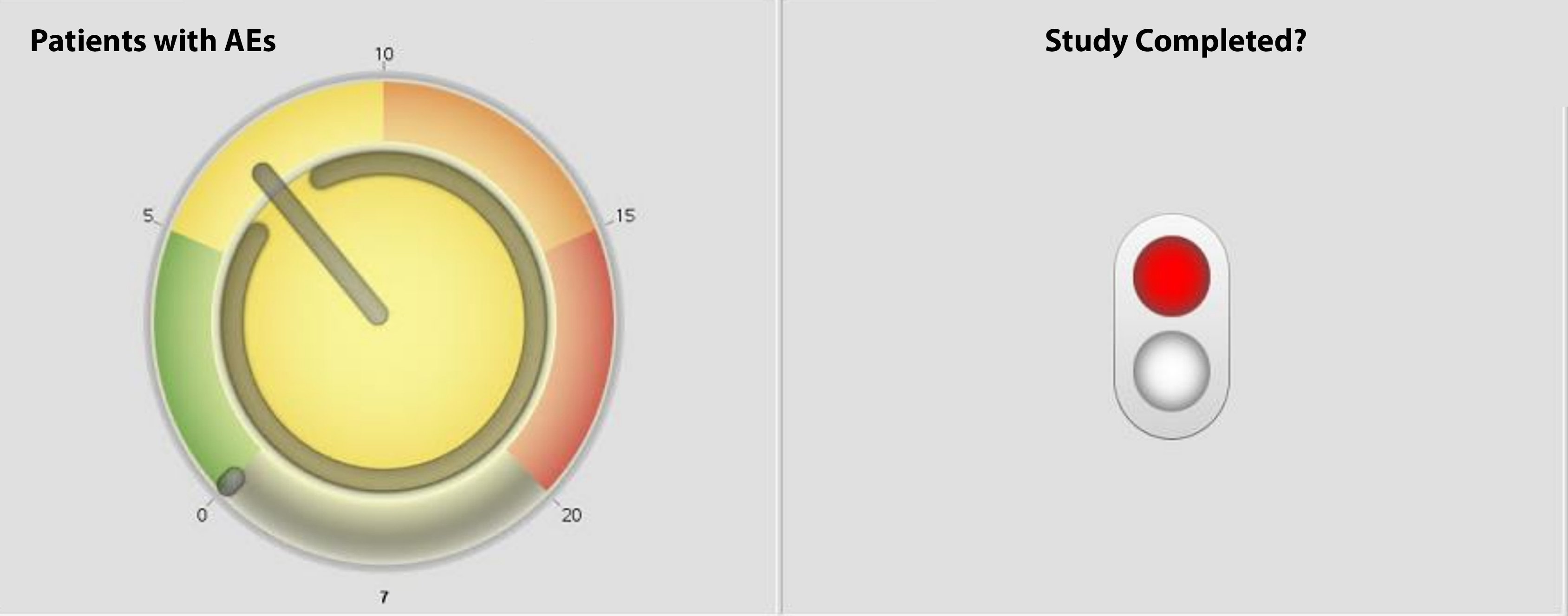
Figure 1. Sample KPIs produced by PROC GKPI
Injection of JavaScript Code into SAS
Specific examples will be discussed later in this paper. In general, injection of java script/HTML code is a process involving modification of default HTML produced by SAS ODS by updating specific HTML tags – commonly <style> and <script> - the latter is usually added. Alternatively, this process can also involve production of HTML code from scratch using SAS environment as framework, a few methods of which have already been discussed.
An update of the <style> tag triggers updates in the <body> as new styles require specific “class=” references in elements which require a change in layout / appearance. From a technical perspective updates can be conducted using standard INFILE & INPUT data set processing and/or with PROC STREAM.
Open Source JavaScript Related Libraries
JavaScript is one of languages which plays crucial role in Web environment. JS communities started development of various Open Source libraries. Some of them have become very successful and can be considered as separate frameworks. We will describe two of them as they can be used for production of interactive visualizations.
D3.js
D3.js (D3) is an open source javascript library for manipulating documents based on data with great control over the final visual result. D3 helps to bring data to life using HTML, Scalable Vector Graphics (SVG) and Cascading Style Sheets (CSS). Additionally, D3‟s emphasis on web standards gives the programmer the full capabilities of modern browsers without referring to a proprietary framework. The framework combines powerful visualization components just waiting for your data to be presented!
Advantages:
- Very good for interactive visualizations
- Vibrant Open source community
- Offers incredible levels of interactivity! The charts are rendered in SVG which enables interaction with each element of the chart
- There are a lot of examples available in the web, so no need to start from scratch
- It supports all of the main data formats like CSV, JSON, TSV, text etc.
- It can have a steep learning curve particularly for those with little previous javascript experience.
Here are some online examples:
- https://bl.ocks.org/kerryrodden/7090426
- https://bl.ocks.org/mbostock/4339083
- https://bl.ocks.org/mbostock/1353700
- http://bl.ocks.org/mbostock/1153292
Chart.js
Chart.js is a powerful open source data visualization library that allows you to draw different types of charts by using the HTML5 canvas elements. You can customize charts in many ways – almost no limitations! However, the best rendering experience can be achieved with the most recent internet browsers (Chrome, Mozilla and IE9+). For the purpose of this paper we decided to use chart.js as we considered it superior to d3.js primarily due to the following reasons:
- Simpler for an inexperienced user
- Very easy to implement, no need of extensive technology knowledge needed
- Eight predefined chart types are already implemented
- It uses native HTML5 Canvas
- Responsive – automatically redraws and rescales charts to fit into changing window size.
Here are some online SAS visual analytics examples of the types of interactive charts that can be produced:
Bar Chart - Population
Line chart - Population
Pie chart - Population
Radar chart - Population
Polar area - Population
Doughnut - Population
Horizontal bar - Population
Please find here 10 Chart.js example charts to get you started
Microsoft Power BI Desktop
The methodologies described in earlier sections require experienced programming resources for the development of the dashboards. Does this mean that dashboards cannot be created by people having no programming background? Certainly not! There are many market solutions that offer good alternative options for those less programming-savvy – SAS Visual Analytics or Microsoft Power BI Desktop are two such examples. We will take a more detailed look at Power BI.
What does Power BI offer?
One benefit is the ability to access many external databases or file structures very easily. A few of the supported data engines include: Microsoft Excel, Text/CSV, XML, JSON, SQL Server, Oracle, MySQL, Teradata, Azure SQL and OData Feeds. SAS can easily export data to JSON/Text/CSV/Excel so a combined solution can also be considered (SAS to produce data and Power BI to visualize).
Power BI is able to detect connections between data sources and build a relational database automatically. This means that analysis across multiple data sources is possible too!
After you access your data you can create dashboards within several minutes simply following drag & drop logic. These dashboards can then be shared with specific individuals.
Dashboards can even be opened on mobile devices, making them very convenient.
This all sounds great but one of the primary disadvantages can be the price, which can make in-house solutions more appealing and competitive.
Pie Chart Like Dashboard - Comparison of Selected Methodologies
Data
Our sample dashboard will be based on the following patient status data:
DATA DATA0;
LENGTH usubjid $4 siteid $1 status $12;
INFILE datalines; INPUT usubjid $ siteid $ status $ statusn;
DATALINES;
0001 1 Ongoing 3
0002 1 Ongoing 3
0003 1 Completed 1
0004 2 Completed 1
0005 2 Discontinued 2
0006 2 Completed 1
0007 3 Discontinued 2
0008 3 Ongoing 3
0009 3 Completed 1
0010 3 Discontinued 2
;
RUN;
Chart.js library based dashboard will use data created by:
** Calculate frequencies for groups **;
PROC SQL noprint;
SELECT count(distinct usubjid) INTO: compl FROM DATA0
WHERE statusn=1;
SELECT count(distinct usubjid) INTO: disc FROM DATA0
WHERE statusn=2;
SELECT count(distinct usubjid) INTO: ongo FROM DATA0
WHERE statusn=3;
QUIT;
** Create datasets to be referred to in PROC JSON **;
DATA DATA0_1 DATA0_2 DATA0_3;
SET DATA0;
IF statusn=1 THEN OUTPUT DATA0_1;
ELSE IF statusn=2 THEN OUTPUT DATA0_2;
ELSE IF statusn=3 THEN OUTPUT DATA0_3;
RUN;
** Specific PROC JSON syntax to create required JSON file **;
PROC JSON OUT="%SYSFUNC(PATHNAME(WORK))\json.txt" PRETTY NOSASTAGS;
WRITE OPEN ARRAY;
WRITE OPEN OBJECT;
WRITE VALUE "Completed";
WRITE VALUE "%sysfunc(compress(&compl))";
WRITE VALUE "Subjects";
WRITE OPEN ARRAY;
EXPORT DATA0_1 (keep=usubjid);
WRITE CLOSE;
WRITE CLOSE;
WRITE OPEN OBJECT;
WRITE VALUE "Discontinued";
WRITE VALUE "%sysfunc(compress(&disc))";
WRITE VALUE "Subjects";
WRITE OPEN ARRAY;
EXPORT DATA0_2 (keep=usubjid);
WRITE CLOSE;
WRITE CLOSE;
WRITE OPEN OBJECT;
WRITE VALUE "Ongoing";
WRITE VALUE "%sysfunc(compress(&ongo))";
WRITE VALUE "Subjects";
WRITE OPEN ARRAY;
EXPORT DATA0_3 (keep=usubjid);
WRITE CLOSE;
WRITE CLOSE;
WRITE CLOSE;
RUN;
The output JSON structure will be created as follows:
[
{
"Completed": "4",
"Subjects": [
{
"usubjid": "0003"
},
{
"usubjid": "0004"
},
{
"usubjid": "0006"
},
{
"usubjid": "0009"
}
]
},
<< repeated for discontinued and ongoing groups >>
]
Power BI was able to import above JSON structure without any problems but as the imported object was not analysis ready (it was imported as table of arrays requiring further drill downs) we decided to use ODS EXCEL to generate data for Power BI instead (from DATA0 as a source).
SAS Based Dashboard - No JavaScript Injections
The following code creates an interactive pie chart which can be just one part of a larger, more complex dashboard. When you click a given segment of the pie a listing of patients falling into the selected category will be opened in new browser tab. From the user perspective this methodology provides interactivity as a subset of all patients is displayed when you click the segment. For serverless approaches all required HTML files need to be created up-front and interactivity is ensured when all HTMLs are linked together through hyperlinks.
*** Add variable for URL ***;
DATA DATA1;
SET DATA0;
LENGTH FILE $50;
IF statusn=1 THEN FILE="completed.html";
ELSE IF statusn=2 THEN FILE="discontinued.html";
ELSE IF statusn=3 THEN FILE="ongoing.html";
LINK="./"||STRIP(FILE);
RUN;
*** produce data listings ***;
%MACRO listing(file=);
ODS HTML PATH="%SYSFUNC(PATHNAME(WORK))" FILE="&file";
PROC PRINT DATA=DATA1 noobs;
WHERE UPCASE(SCAN("&file",1,"."))=UPCASE(status);
RUN;
ODS HTML CLOSE;
%MEND;
%listing(file=completed.html);
%listing(file=discontinued.html);
%listing(file=ongoing.html);
*** definition of template for pie chart ***;
PROC TEMPLATE;
define statgraph piechart;
begingraph;
entrytitle "Pie Chart";
layout region;
piechart category=status /
datalabellocation=inside
dataskin=sheen
categorydirection=clockwise
start=180
url=link;
endlayout;
endgraph;
end;
RUN;
ODS HTML PATH="%SYSFUNC(PATHNAME(WORK))" FILE="piechart1.html" GPATH="%SYSFUNC(PATHNAME(WORK))" HEADTEXT="";
ODS GRAPHICS / reset=all IMAGENAME="piechart" imagemap=on;
TITLE;
FOOTNOTE;
PROC SGRENDER DATA=DATA1 TEMPLATE=piechart;
RUN;
ODS HTML CLOSE;
By default this listing would open in the same window – it is why default behavior needed to be changed by using HEADTEXT="" option in main ODS statement. When more customization is needed, e.g. instead of listing opened in new tab we would like to see nicely formatted pop-up window, then injection of javascript code is required instead.
The left side part of Figure 2 presents what you will see after running the above code. And the right side illustrates the interactivity component after „Ongoing‟ segment was clicked. To be precise – in order to present data listing side-by-side you need to click right button of a mouse and select “open in new window” and then move the window as needed. This can be also achieved by custom injection of javascript code as described earlier.
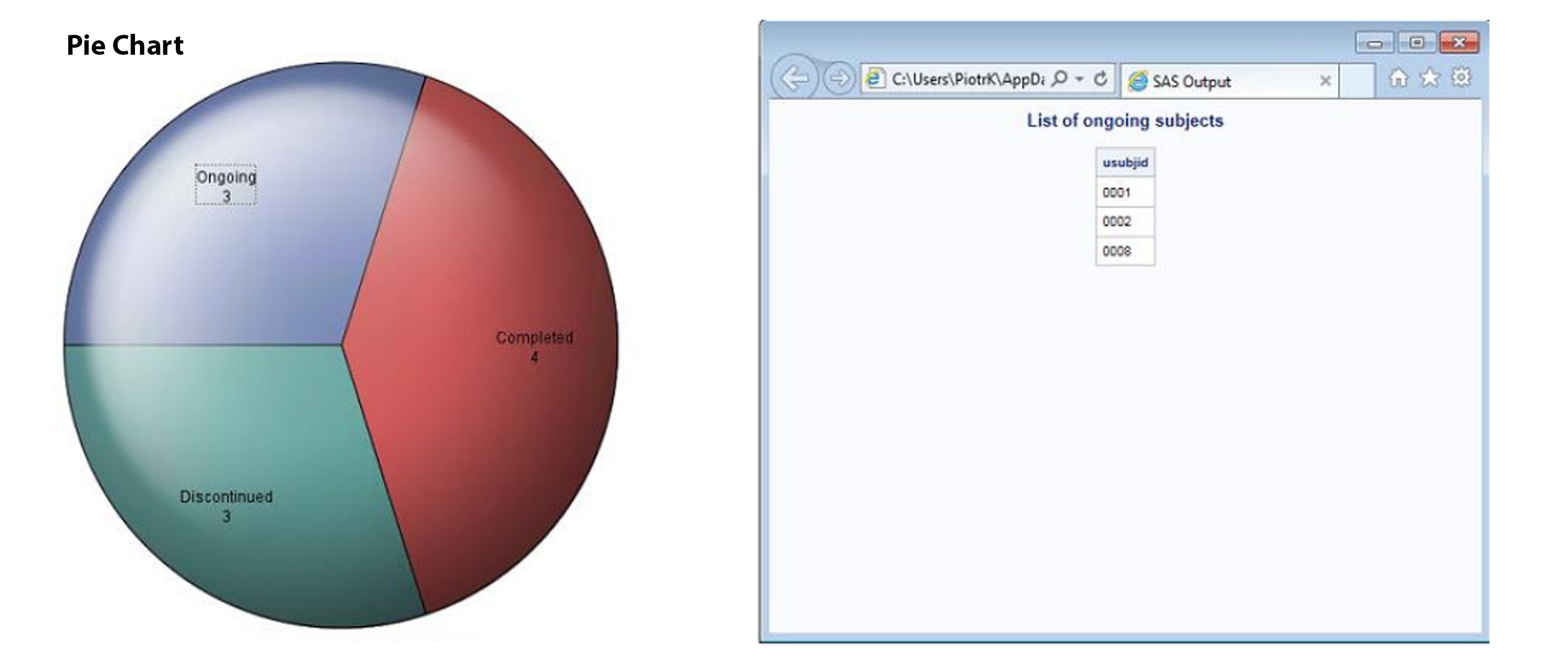
Figure 2. Interactive Pie Chart Produced by SAS
Chart.js Library Based Dashboard
As we are working in a serverless environment we cannot connect to external text files through javascript. There are techniques (e.g. AJAX request) which allow access to text files on a server but this scenario is not covered in this paper. This means that we cannot use pure javasript code to access our JSON file. To bypass this issue we will use a combination of SAS & javascript – we will inject the contents of json.txt into an HTML file using SAS.
The first step in this method is to write HTML code which will do the job. The following code will be saved as %SYSFUNC(PATHNAME(WORK))\index.html. In short, the code below contains all we need apart from the JSON data (you can review comments added below – initiated with “//” – to follow logic of the javascript). The place where JSON data needs to be injected is flagged as “// PLACEHOLDER FOR JSON”. This needs to be replaced with the proper JSON structure – in our example this is captured in our json.txt that we generated earlier. In addition, code below assumes that jquery-2.1.3.min.js and chart.js libraries are stored in the same location as html file. The libraries should be copied over from https://code.jquery.com/jquery-2.1.3.min.js and https://cdnjs.cloudflare.com/ajax/libs/Chart.js/2.2.1/Chart.js respectively.
<!DOCTYPE html>
<html lang="en">
<head>
<meta charset="UTF-8">
<script src="./jquery-2.1.3.min.js"></script>
<script src="./Chart.js"></script>
<title>PIE chart using Chartjs and JSON data</title>
</head>
<body>
<div class="container">
<h2 class="text-center">PIE chart using Chartjs and SAS data</h2>
<canvas id="pieChart" width="400" height="400"></canvas>
</div>
<script type="text/javascript">
//PLACEHOLDER FOR JSON
var labels = [];
var count = [];
var subjects = [];
//Get values from JSON and assign the values to variables
for (var x = 0; x < jsonData.length; x++) {
labels.push(Object.keys(jsonData[x])[0]);
count.push(Object.values(jsonData[x])[0]);
subjects.push(jsonData[x].Subjects);
}
//Construct data structure variable
var getJsonData = {
datasets: [{
data: count,
backgroundColor: ["#F7464A", "#FDB45C", "#46BFBD"]
}],
labels: labels
};
//Creating Chart.js Chart in javascript and assigning the data
var canvas = document.getElementById("pieChart");
var ctx = canvas.getContext("2d");
var myNewChart = new Chart(ctx, {
type: 'pie',
data: getJsonData,
options: {
title: {
display: true,
text: 'Status of Patients'
},
legend: {
display: true,
position: 'bottom',
},
responsive: true,
maintainAspectRatio: false,
}
});
//On click showing the relevant subjects
canvas.onclick = function(evt) {
var activePoints = myNewChart.getElementsAtEvent(evt);
if (activePoints[0]) {
var chartData = activePoints[0]['_chart'].config.data;
var idx = activePoints[0]['_index'];
var label = chartData.labels[idx];
var url = '';
var subjectChild = [];
var children = [];
//display subject id's in popup
for (var x = 0; x < subjects.length; x++) {
if (label === labels[x]) {
for (var y = 0; y < subjects[x].length; y++) {
subjectChild = subjects[x][y].usubjid + '\n\n';
children.push(subjectChild);
}
url = label + " : " + '\n\n' + children;
url = url.replace(/,/g, "");
}
}
//Alert to show result
alert(url);
}
};
</script>
</body>
</html>
Next we turn to SAS. The following code reads both HTML & JSON files generated earlier, joins them together appropriately and finally the completed version of html code is saved. This method gives improved User Interactivity as when you click a given area of pie chart a simple pop-up containing list of patients with a given status shows up, without navigating you away from the page or opening a new file.
Note: HTML will be rendered correctly in modern browsers like Chrome or Mozilla Firefox. However the JavaScript used doesn't fully support IE family, so you can get mixed results.
** Read HTML and JSON files into SAS data step **;
DATA _HTMLCODE0;
LENGTH htmlcode $ 1500;
INFILE "%SYSFUNC(PATHNAME(WORK))\index.html"
DLM = "€" TRUNCOVER LRECL=1500;
INPUT htmlcode;
ID=_N_;
RUN;
DATA _JSON0;
LENGTH htmlcode $ 1500;
INFILE "%SYSFUNC(PATHNAME(WORK))\json.txt"
DLM = "€" TRUNCOVER LRECL=1500;
INPUT htmlcode;
ID2=_N_;
RUN;
** Get number of row where injection needs to be made **;
DATA _NULL_;
SET _HTMLCODE0;
IF PRXMATCH("/PLACEHOLDER/i",htmlcode)>0 THEN
call symputx("inj_row",ID);
RUN;
** Append all together **;
DATA _HTMLCODE1;
SET _HTMLCODE0
(WHERE=(ID LT &inj_row))
_JSON0
_HTMLCODE0
(WHERE=(ID GT &inj_row));
IF ID2=1 then htmlcode="var jsonData = "||htmlcode;
RUN;
** Produce revised HTML file **;
DATA _null_;
SET _HTMLCODE1;
FILE "%SYSFUNC(PATHNAME(WORK))\jschart.html";
varlen=LENGTH(htmlcode);
PUT @1 htmlcode $varying200. varlen;
RUN;
The left side part of Figure 3 presents what you will see after opening html file. And the right side illustrates the interactivity component after „Discontinued‟ segment was clicked. Please note that in this case no additional customization is needed to display exactly as on Figure 3. If you are interested in moving the pop-up off the pie chart then it would require more coding as pop-up showing over parent object is default.
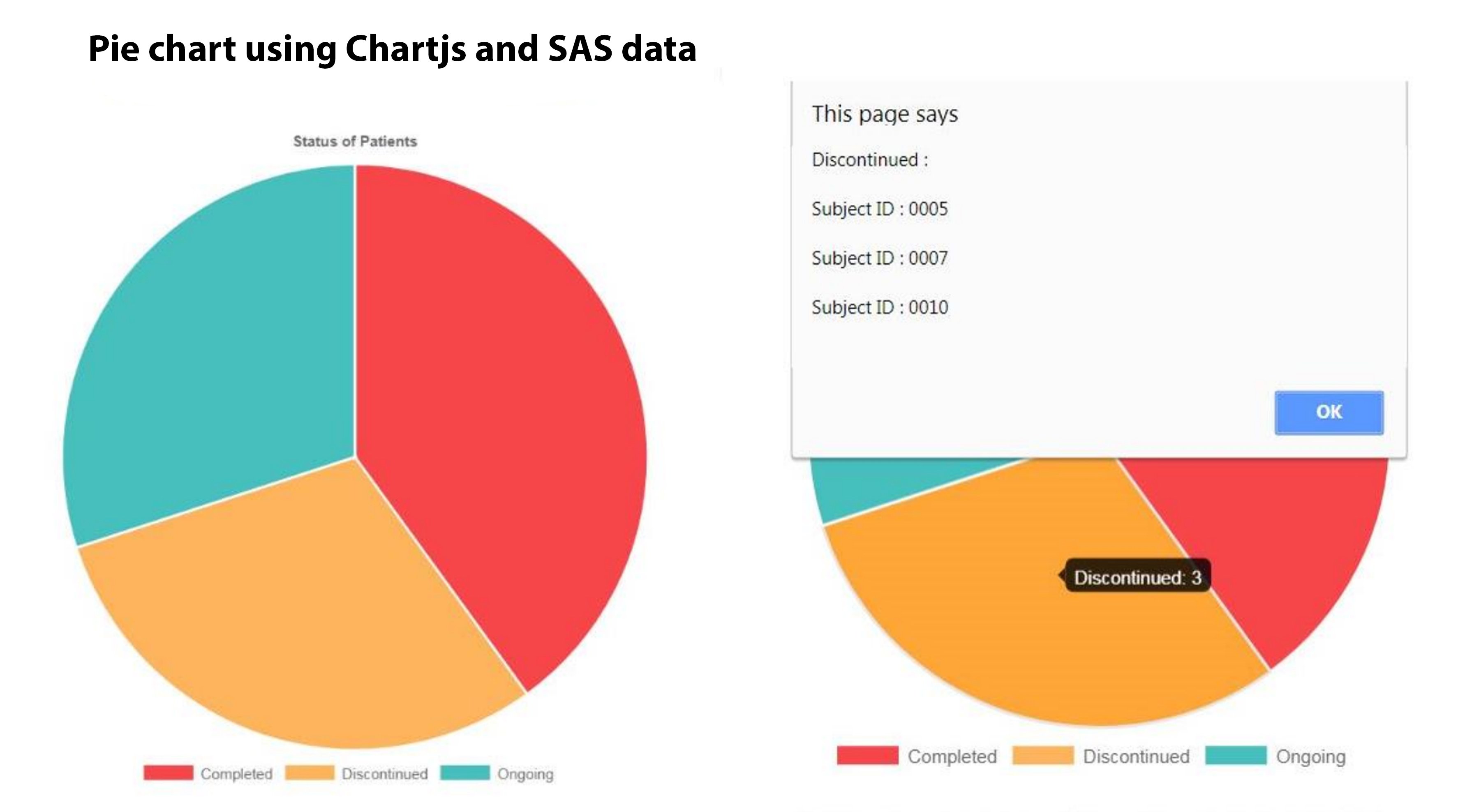
Figure 3. Interactive Pie Chart Produced by Chart.js
Microsoft Power BI Based Dashboard
We have discussed two methodologies which require writing code to get expected result. When higher levels of interactivity are needed for the dashboard the code may become really long and complex. We will now investigate how much time is needed to create a similar pie chart (interactivity enabled) using Microsoft Power BI Desktop 64-bit. This paper doesn't go through all of the functionalities but instead only focuses on the elements crucial to produce the dashboard. The first step is to import the data by using “Get Data”. A list of imported variables will be seen on the right-side panel as shown in Figure 4 below.
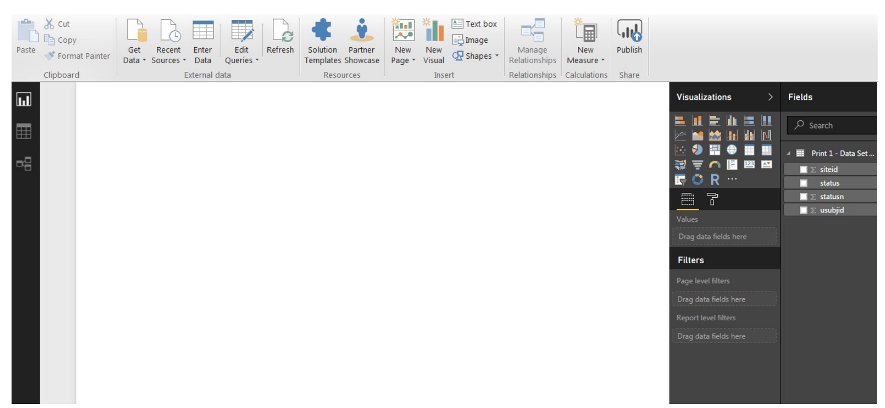
Figure 4. Screen after Importing Data
To create a pie chart you need to click the respective icon in the “Visualizations” section (initially an empty figure will show up) and check the boxes for USUBJID and STATUS variables. This will create an initial version of the plot. In a similar way, next to the pie chart you need to add a Table with the USUBJID, SITEID and STATUS columns present.
Next we need to fix the default settings of both objects so that they make more sense!
For the pie chart:
- In the legend section the STATUS variable needs to be selected
- In the values section USUBJID should be selected. Check to ensure that the “count (distinct)” option is selected from drop-down.
For the table
- In the values section – USUBJID, SITEID and STATUS should be seen
- The “Don‟t summarize” option from the drop down (as it is listing) for all variables should be selected.
After completion of all steps above you should see a dashboard similar to Figure 5. When you hover the mouse over a specific area of the plot a Tooltip containing additional information will be automatically shown. It will disappear after you remove the mouse pointer from the area
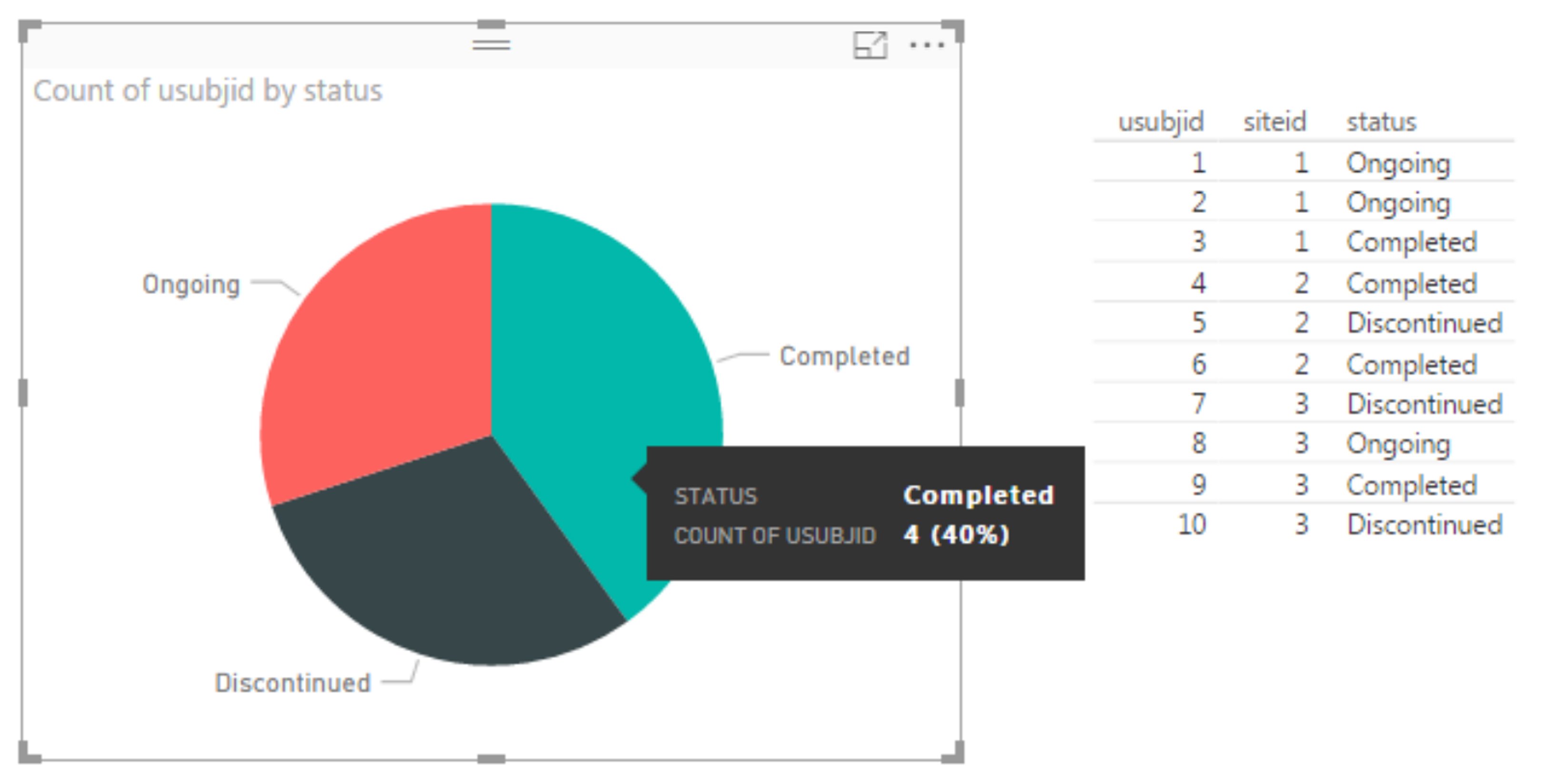 Figure 5. Pie Chart, Listing and Tooltip
Can we have any more interactivity here? Yes! When you click any area of the chart, the table object (and any other object you might add into the dashboard) will be subset/recalculated to reflect only the data in from the selected area. This is reflected in Figure 6 below. Drilling down is default behavior of Power BI.
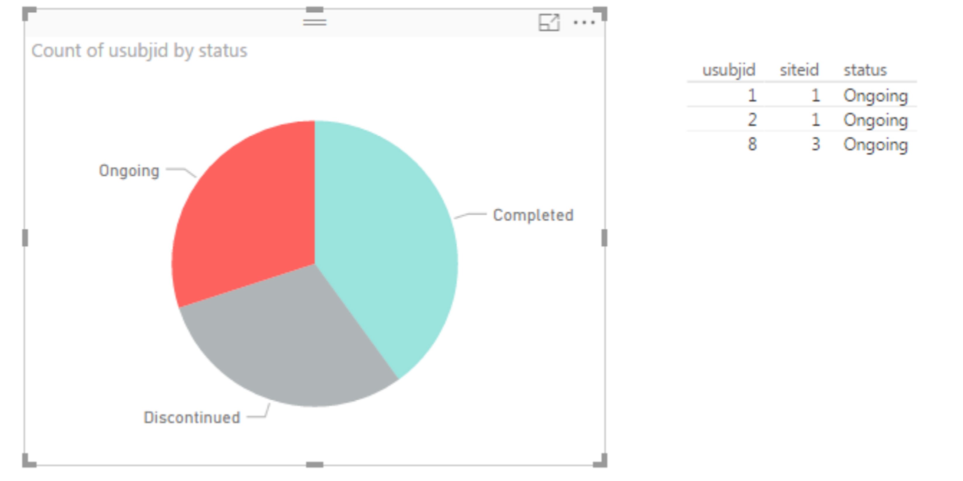 Figure 6. Drilled down dashboard
You can have as many elements on the dashboard as you want but if you would like to implement specific customizations it may not be possible if it is not available within the standard interface. Some solutions can be resolved by calling specific R script (“R” button below) but this would require additional coding time and negates one of the key benefits of not needing to be a programmer.
Conclusion
Which solution presented in the previous section is the best? Surprisingly I will not answer this question directly, each solution has its own unique benefits and challenges that will fit different users and scenarios. I will instead discuss the approach that my company selected based on many months of pros and cons analyses.
From the perspective of technology we decided to use SAS for generating the input data (in JSON format) and all further steps are done in JavaScript. Based on our research it is the direction the market is moving toward. Additionally, we already had all of the tools required for this approach available to us without purchasing additional software.
At the same time, we reached the conclusion that the framework to be used for production was not the main driver, instead it is really the contents and input data which matter the most.
For example, let‟s imagine situation where we would like to build dashboards helpful in monitoring sites. Would Microsoft Power BI or SAS Visual Analytics help in making decision on what should be put into visualization containers? Those tools would support analyzing everything but it is not what you usually need. In this specific scenario we deployed our statistical consultancy team which helped in defining methods and models needed to compare sites. The results of the statistical analyses are then put into JSON format and displayed using chart.js. SAS visual analytics can also be used for banking, public health, retail insights, manufacturing and utilities.
The other aspect is data we would use for building the dashboards. All described methods support JSON formats as input. Again the questions we faced are:
- Can we always say that we are collecting data in consistent way?
- Are we refreshing them automatically?
- Is access to data secured?
When contents and data sources are clarified it should be easier to select the proper technology to visualize for your specific needs.
Get your free copy of Quanticate's last resource on Define.XML
Quanticate's statistical programming team can support you with Clinical Trial with the creations of TLFs, and any CDISC Mappings or SDTM conversions. Our team of experts would be happy to provide support and guidance for your development programme if you have a need for these types of services please submit a Request for Information (RFI) and member of our Business Development team will be in touch with you within 2 business days.
References
Hinson, Joseph. 2016. “The New STREAM Procedure as a Virtual Medical Writer.” Proceedings of the Application Development Section. Denver, CO: PharmaSUG. Available at https://www.pharmasug.org/proceedings/2016/AD/PharmaSUG-2016-AD17.pdf
SAS Institute. “SAS® 9.4 JSON Procedure Tip Sheet”. Available at https://support.sas.com/rnd/base/Tipsheet_PROC_JSON.pdf http://www.chartjs.org/samples/latest/
https://d3js.org/


